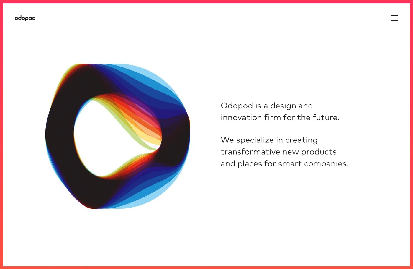
Building a design firm for tomorrow. Odopod's focus is on two areas: digital products and connected places.
After a 2 year hiatus as Nurun San Francisco, our office was able to rebrand to Odopod. This came with a fresh new logo, visual language and website. We saw this as a great opportunity to make a super clean modern rebranding. A small team and I took on this challenge. Over the course of a year we designed, launched, followed analytics, made changes and relaunched.
Starting from the ground up in terms of brand - we explored logos, font choices, colors, and interaction patterns that would make our site feel fresh in the crowded genre of agency websites.
Making It Happen
Once we were happy with the design style, I started prototyping the pages together in inVision to get a feel for the flow. It really shined a light on problems and gave us the oportunities to test the experience on our phones.


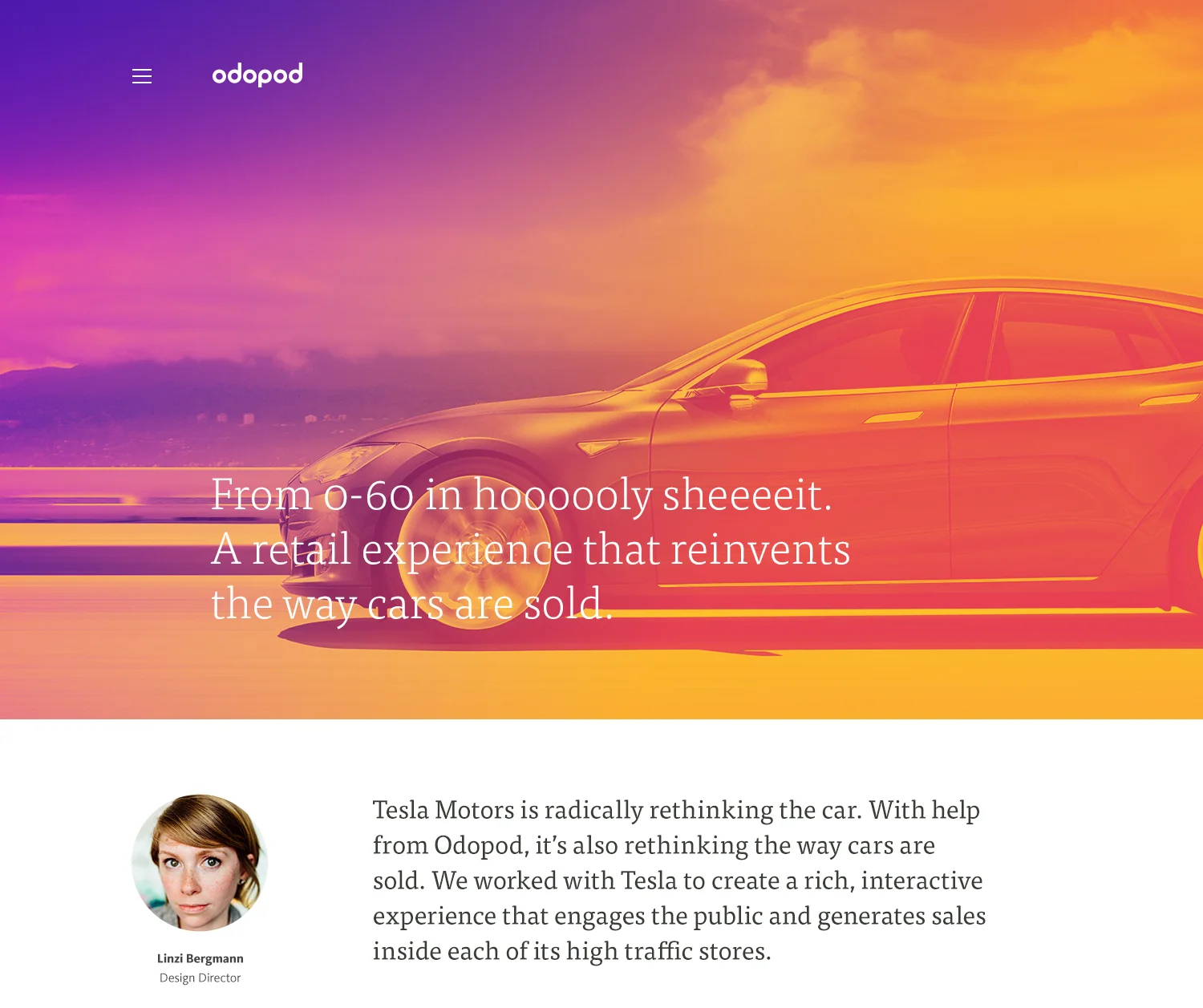
In the end, radical simplicity won the day. It was important we not distract from the quality of the work with a flashy page. Instead we focused on bold color, typography and thoughtful imagery to tell the real Odopod story.