
Playstation Store Game Detail
Sony Playstation was looking to redesign their on-console store game pages to focus on getting people excited about new games. As art director, I worked embedded at Sony and led a small team from wireframes through motion prototypes to launch a redesign that prioritizes video content and re-architects game pages into useful hubs for gamers, taking the first step in bringing the Playstation Store closer to the team's vision.
LIVE ON
PS4 Console Store
ROLE
Art Director
YEAR
2016
The above motion prototype was executed by me to show the engineering team the vision for autoplaying game trailers on the Cover Page, and the relationship between the Cover and the Media Browsing Page.
Below is the PS4 store as it stood when we began redesigning the page. The team at Sony had done great in pinpointing pain points and having a strong vision for a full screen immersive page based system for these Game Detail Pages (GDPs).
The Original PS4 Store GDP

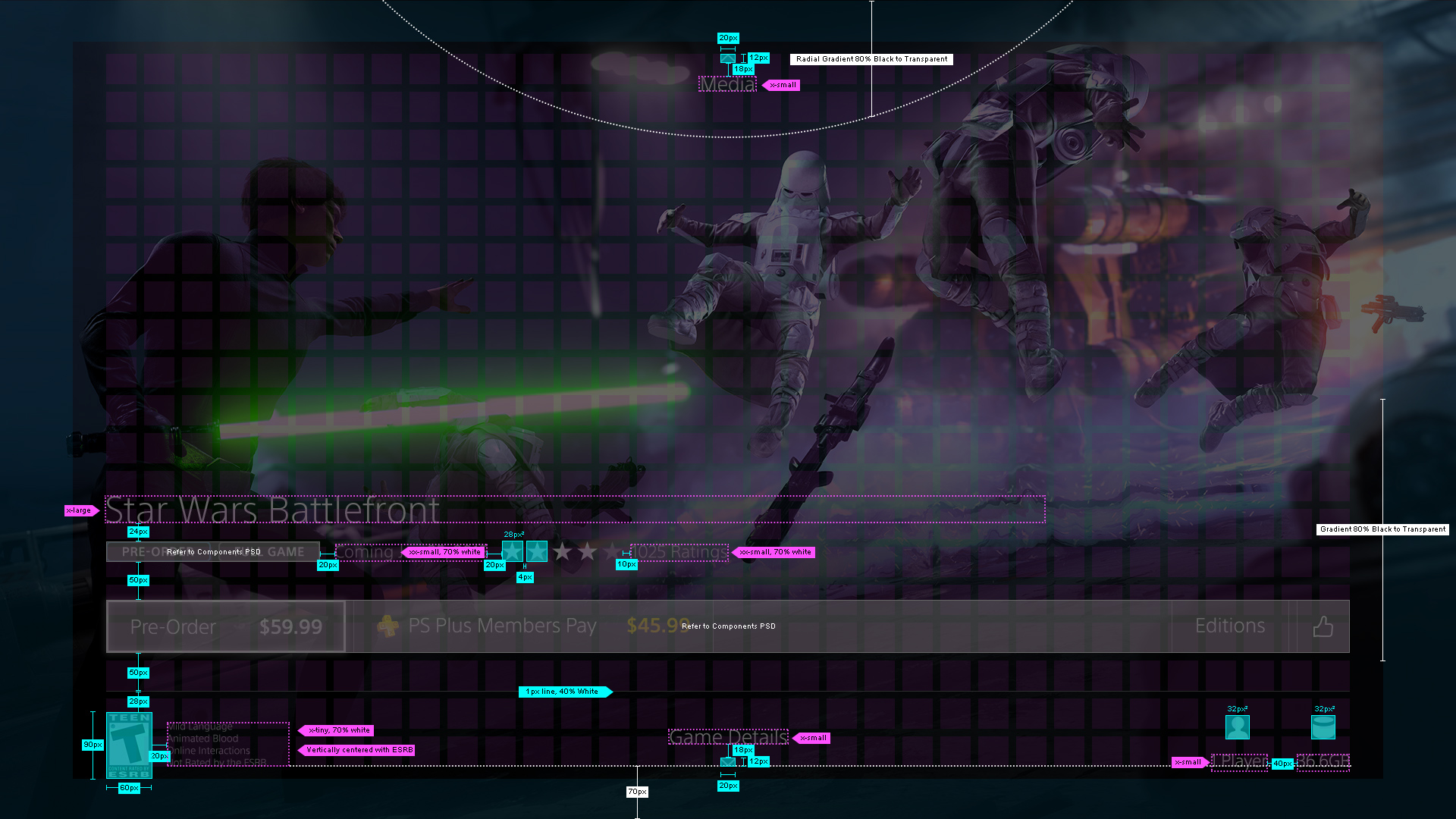
Data showed a significant conversion rate once a user watched the game trailer, so it was important that we immediately begin playing it passively in the background of the Cover Page. The user is then always greeted by the ability to go up or down through the GDP.
As illustrated below – we never wanted a page to be more than one tap away so all internal movement in a page is lateral. Also as a user gets further from the cover page the content broadens, going from game specific details, to special editions of the game, to in game purchases, to related games so the user has an out if the game isn't for them.
A Birdseye View of our UX Solution

In visual design we wanted each game to feel unique with as little curation as possible. We decided on Sony choosing one splash image for each game. This image shows up when landing on the page while the trailer loads, and appears blurred in the background of each page below the Cover. In animation we decided to parallax the blurred image as one navigates down to show vertical movement more convincingly.
Playstation has a fantastic brand with thoughtfully made guidelines – so we were able to stay within their console typography system, button language, and even some interaction patterns. It was important that users feel like this is part of the PS4 ecosystem as all GDPs will be transitioning to this style over the next year.
Final Designs
Of course designing for a television set has it's own set of considerations. Safe zones, overscan, contrast, and type size at a distance became our lives for the days leading up to our handoff to engineering. The team constantly tested legibility throughout the project and managed to track down bad TVs to test our colors and safe zones on.
I can't say enough about the team at Sony. They were easy to work with and welcomed me and my designer into their offices for this project. Now that the work is live on the Playstation 4 Store I can say the engineering team did a terrific job translating our designs and motion prototypes into something we can all be proud of. And they've already come back to work with us more on the PS4 brand.